Cover Maker
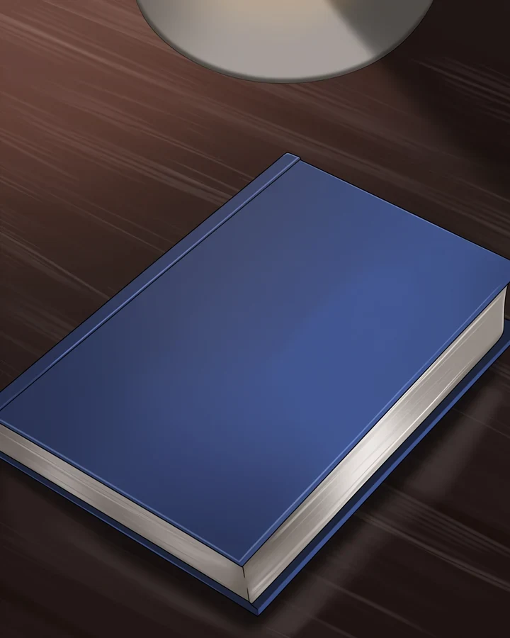
A cover is seen at thumbnail size long before anyone sees it full size. This composes with that in mind: a clear focal point, a readable silhouette, and deliberate empty space where your title will sit.
Design for the thumbnail first
Shrink any cover to 120 pixels wide. If you cannot tell what it is, it has failed - No matter how good it looks large.
- Strong silhouettes survive the shrink. Fine detail does not, which is why restyling rarely rescues a weak cover.
- High contrast survives. Low-contrast palettes turn to mush.
- One focal point survives. Three competing ones become noise.
Leave room for type
A cover generated edge-to-edge leaves nowhere for a title, and text dropped over a busy area is unreadable.
Reserve a zone
Usually the upper or lower third. Decide before you generate, not after.
Keep it quiet
The reserved area should be low-detail - Sky, wall, shadow.
Check contrast
Light type needs a dark zone and vice versa.
Finishing the cover
Panel Maker builds the episode; this builds its front door. To adjust framing afterwards use the cropper, and to add bleed use Canvas Expander.
Covers that pass the thumbnail test
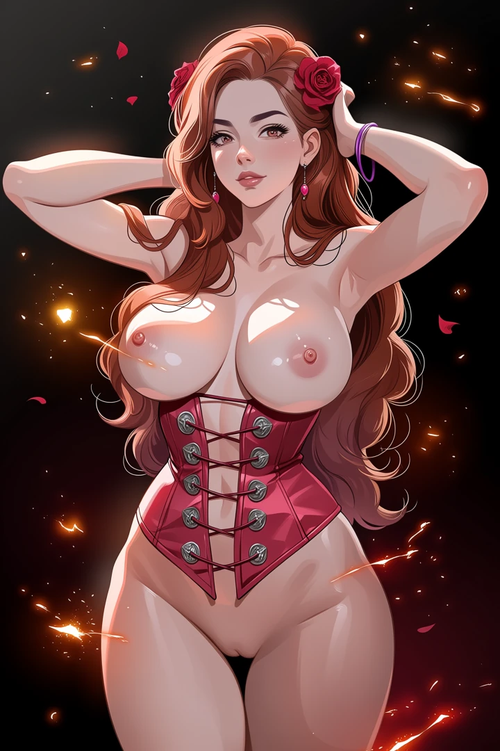
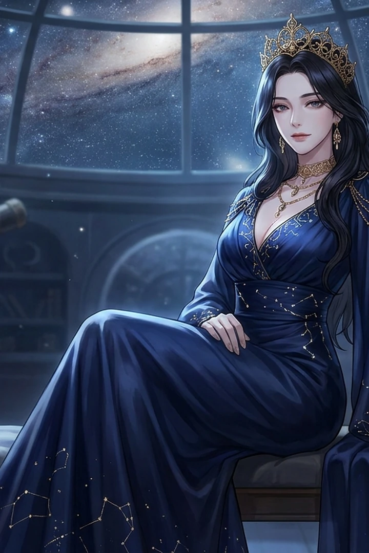
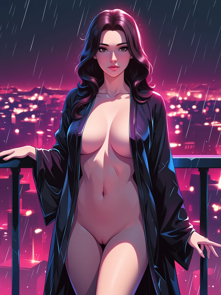
Real before-and-after pairs, one per case. Source photographs are genuine API output; the conversions here were rendered with a stand-in model while the converter's provider was unavailable, so treat them as style references rather than shipped-tool output.
Worked example: a series cover that survives the thumbnail test
| Composition | Portrait, 1024x1280 |
|---|---|
| Reserved space | Upper third, low detail |
| Cost | 5 credits |
| Check at | 120 px wide |
The exact instruction
single figure lower two-thirds, strong silhouette against a bright sky, high contrast, upper third kept simple and low detail for a title, no text
What comes back
Shrink the result to 120 pixels. If the figure still reads and the top third is still quiet, it works. Most covers fail this test and look fine at full size.
When it goes wrong
| What you see | Why | What to change |
|---|---|---|
| Unreadable as a thumbnail | Low contrast or too many focal points | One subject, high contrast, strong silhouette |
| Nowhere to put the title | Generated edge to edge | Reserve a quiet zone before generating |
| Title is illegible over the art | Reserved area is busy | Move type to the calmest region, or use the cropper |
Common questions
Does it add the title text?
No. It composes artwork with space reserved for type, which you add in your own layout tool.
What aspect ratio should a cover be?
Portrait, and always check it at thumbnail size on a phone before committing.
Why does my cover look weak in a list?
Almost always low contrast or too many focal points. Both vanish at small sizes.
Where to go next
This tool is usually used alongside build the episode, reframe for a platform and extend the artwork.