Colour and light
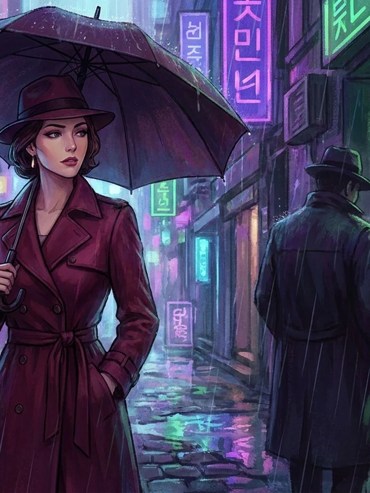
Colour is the fastest emotional signal in an image, and the one most often left to chance. Naming a palette and a light source does more for mood than any adjective about atmosphere ever will.
Restrict to strengthen
A picture using three related colours plus one accent reads as designed. A picture using every colour reads as noise.
- Three related hues plus one accent is the working formula, and Anime Restyle can apply it to finished work.
- Restriction is what makes a palette legible.
- Models follow a named restriction well - So name it.
Light has three properties
All three are directable, and all three are usually left out entirely.
Direction
Side light sculpts. Front light flattens. Back light silhouettes. This is the single biggest lever.
Quality
Hard light gives sharp shadows and drama. Soft light gives gradual falloff and calm.
Colour
Warm reads as intimate or nostalgic. Cool reads as clinical, lonely, or nocturnal.
Temperature contrast creates depth
Warm light on a subject against a cool background separates the two and produces depth without changing the composition at all. It is the most reliable trick on this page, and it works in every genre - From romance to cyberpunk.
Reserve the accent
Two decisions carry more mood than any palette list: where the accent lives and where saturation peaks.
- Choose one accent colour for the emotional object - A tie, lipstick, a warning light, a flower - And repeat it later to build visual memory.
- High saturation belongs at peaks. If every panel is neon, none feels intense - Let quiet scenes run narrow, softer palettes so the climax has somewhere to go.
Common questions
How do I stop my images looking flat?
Name a single light direction. Flatness is almost always the absence of directional light.
What is the easiest way to improve mood?
Change the light colour. Warm and cool versions of an identical scene read as different stories.
How many colours should a palette have?
Three related hues plus one accent. More than that and the image stops reading as designed.
Where to go next
This guide pairs with restyle palette, extreme colour lighting and camera and light together.